Not everyone is reading the rainbow
By Teodora Stoica
Title: The misuse of colour in science
Author(s) and Year: Fabio Crameri, Grace E Shepard, Philip J Heron (2020)
Journal: Nature Communications (open access)
| TL;DR: Visualizing data is paramount in scientific research, yet many researchers still use outdated color maps. It’s time to use scientifically derived color maps in order to avoid alienation and misleading results. Why I chose this paper: I have been a proponent of accurate data representation and visualization for some time, and I’m very glad there is a Nature paper that succinctly summarizes the importance of using scientifically-derived color maps for data communication. |
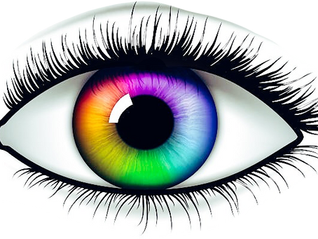
The rainbow is pretty. If you ask Skittles, it may even taste spectacular. However, the standard Red-Green-Blue (RGB) color scale is the most scandalously dressed friend in the room: they hog all the attention and detract from the subtle color variations in others’ clothes. Importantly, 0.5% of women and 8% of men worldwide are color-vision deficient, which means whatever statement RGB is trying to make doesn’t register among these folks.
The Details
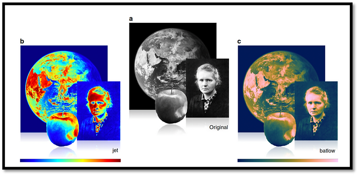
Any color map maps numeric values to a specific color (much like coordinates on an X/Y axis). RBG have many issues (discussed below), but a scientifically derived color map (batlow panel below) corrects for them by assigning colors to numeric values that are perceptually uniform without visual distortion. As illustrated in Figure 1, it is undeniably easier to distinguish the picture of the Earth, apple, and Marie Curie in the right scientifically derived panel (batlow) than in the left panel (rainbow/jet color map).
The present article discusses the use of rainbow-like color maps in scientific illustrations, and argues that it restricts data understanding to only the normal color-vision population, but worse – results in erroneous data interpretations. You wouldn’t want a misinterpretation of a heart disease diagnosis or confusing the direction of an incoming hurricane. If colored improperly, scientific pictures detract, instead of enhancing the meaning of the data, for scientists and the public alike.
The Results
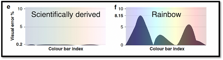
The article illustrates several color concepts to consider when representing data. The first is uniformity, or equal steps in data that are perceived as equal steps in the color space. One of our not-so-distant human dreams is to safely land on the planet Mars. This remarkable technological feat depends on accurate visualization of topographical data received from the Mars Rover. A perceptually uniform color map, that is – a map where colors are equidistant from each other – can be the difference between interpreting the terrain as flat (Figure 2, scientifically derived color map) or rough (Figure 2, rainbow). Imagine trying to maneuver the Mars Rover on the terrain represented by the rainbow map, compared to the scientifically derived one!
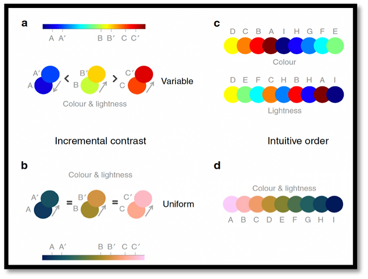
Besides uniformity, perceiving color order is yet another important scientific color map design concept as it ensures the color gradient is easily and intuitively understandable and allows qualitative understanding of a data set. For optimal understanding, color maps need to show that both lightness and darkness increase linearly. In Figure 3 (a,c), the rainbow/jet color map is inconsistent in gradation – sometimes increasing, sometimes decreasing in color and lightness. The scientifically derived colormap (b,d) uniformly increases in both color and lightness, which assists scientists in making accurate data conclusions, while also catering to the color-blind population by reproducing a smooth gradient.
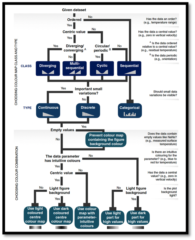
Understanding the benefits of using perceptually uniform color maps is easy, but creating such maps is complex. Fortunately, a considerable amount of research has been conducted on this topic and various freely available maps ready for scientific use are available. Such tools can make scientific color map implementation effortless. To ensure their correct application in all data visualization, the authors created a straight-forward flowchart that guides scientists in choosing the correct scientifically derived color map for their dataset (Figure 4). The chart asks simple questions such as “Does the data have an order?” and “Should small data variations be visible?” that can help the researcher choose the correct color map class and type. Furthermore, it specifically guides the researcher in choosing color combinations by asking questions such as “Is the background light?” and “Does the data contain empty values?”
The Impact
Using color maps that correct for visual distortion by assigning colors to numeric values that are perceptually uniform is paramount for accurate data visualization and comprehension. A list of these specific types of scientifically derived color maps is freely available here. If researchers are unsure whether the color maps they are using qualify as scientifically derived, they can ask themselves three simple questions:
Do two adjacent colors have a different color variation compared to another set of adjacent colors?
2) Does the figure contain similarly bright red and green colors?
3) Is the rainbow/jet color map used?
Answering “yes” to any of these questions disqualifies researchers from using their selected color map in their public scientific dissemination materials.
Although graduate school training currently does not mandate researchers to take visualization courses, it is vital to be aware of their specific nuances for accurate data representation. As for the rest of us, being aware of how color is used in data dissemination and becoming familiar with scientifically derived color maps can make the difference between misinterpreting the results of a finding and accurately translating the science to the general public. Improved accessibility to scientific data is a no brainer and using scientifically derived color maps is simple. It’s time to uninvite RGB from the party.