
Eye-Catching Photos Boost Public Engagement with SciComm Interpretive Signage
By Carolyn Pralle
Title: A picture is not always worth a thousand words: The visual quality of photographs affects the effectiveness of interpretive signage for science communication
Author(s) and Year: Lei Zhu, Lloyd S. Davis, Anna Carr; Published in 2021
Journal: Public Understanding of Science (closed access)
| TL;DR: A high-quality photograph increases reader interest and comprehension of sci-comm content on park signage. A bad picture is worse than no picture. Why I chose this paper: I recently worked on an interpretive signage project with a wildlife refuge, and choosing the right photos was a challenging but rewarding part of the sci-comm design! This article offers some empirical evidence that the photos are really worth the effort. |
The Takeaway
Every park, museum, and zoo (not to mention every public road) has signage designed to deliver information to visitors. But how often do you really stop and look? Would an attractive photograph compel you to pause and read a sign more carefully?
As science communicators, we learn early in our careers that visuals are an essential tool in our communications tool bag. Zhu, Davis, and Carr provide empirical evidence for that tried-and-true practice. Including a high-quality photo on interpretive signage had a significant positive impact on people’s interest in reading the sign and their comprehension of the corresponding text.
The Details
The Background
Using visual aids is one of the cardinal rules of science communication. But why? In a general sense, sci-commers expect visuals like photographs and drawings to positively influence affective (emotional) and cognitive (intellectual) aspects of audience engagement, which are often key goals in our outputs.
In 2017, Zhu, Davis, and Carr decided to put this visual rule to the test. Their experiment involved a nature interpretation project at a Chinese National Park: the XNWP, a popular tourist attraction famous for its wetlands. Interpretive signage is often used in national parks to teach visitors about culture, history, and nature within the park. The goal was to inform park visitors about a common and enigmatic bird (the common kingfisher) and local nature conservation.
The researchers focused on photographs for two reasons. First, photos are useful for depicting realistic natural imagery like animals which can be otherwise difficult to see in the wild. Second, digital photos are increasingly easy to produce, thereby offering an accessible and attractive visual option. The big question was: how does the visual quality of a photograph affect interest in reading the sign and comprehension of the text?
Methods
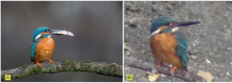
Zhu, Davis, and Carr developed three versions of an interpretive sign for the XNWP national park. Each sign had identical text but different visuals. One version had a high-quality photograph of a kingfisher. Another had a poor-quality photograph of a kingfisher. The third had the park logo instead of a photograph. The researchers used the online application Acquine to rate each photo’s quality. The high-quality photo earned an 8.9/10.0 while the poor-quality photo was rated a 4.6/10.0 (Figure 1).
For consistency, the researchers installed the signs in the same location along a main path and monitored the signs for the same lengths of time in summer of 2017. From a distance, they recorded whether visitors stopped at the sign or passed by without reading. Researchers also offered visitors a three part questionnaire including:
- Demographic information (age, gender, education, and prior interest in birds)
- Questions on the effectiveness of the sign (Likert-scale questions about the attractiveness, enjoyment, and understanding of the sign)
- A knowledge test about the information on the sign (visual questions about the pictured kingfisher and behavioral questions about the text).
To account for bias in the knowledge test, the responses were grouped based on the participants’ prior interest in birds. Statistical analyses helped unpack the relationships and variance in the observational and survey data from this sci-comm experiment.
Results
Visitors stopped most frequently to read the sign with the high-quality photograph. Visitors stopped least often at the sign with the poor-quality photograph. The control sign (logo instead of photo) was rated as significantly less attractive than either sign with a photograph.
The survey respondents skewed younger and more highly educated than the general population, possibly because of the park’s proximity to a large university. Although some respondents had “specialized prior interest in birds,” the majority identified with the “general interest” and “no interest” categories. People in the latter two categories likely got their knowledge about kingfishers from the study signage, making those survey data more meaningful for measuring the sci-comm effectiveness of the signage.
The sign with the high-quality photograph had the greatest “image-related effectiveness.” This meant visitors who saw the sign with the high quality photograph enjoyed and understood the text content of the sign significantly more than those who viewed the other signs.
When answering questions about the kingfisher’s appearance, visitors who experienced the high quality image outperformed visitors who saw the low quality image. More surprisingly, respondents performed better on the behavioral questions if they had seen the high-quality photograph, even though the behavioral information came only from the identical text on each sign.
This study strongly suggests that high quality images increase engagement and knowledge retention in sci-comm . Since this relationship was even stronger among respondents who self-declared “no interest” in birds, high-quality photos may help science communicators reach audiences who aren’t already familiar with their topic.
The Impact
Zhu, Davis, and Carr provide empirical evidence that high-quality photographs have meaningful effects on public engagement with sci-comm materials, specifically nature-based interpretive signage. The high-quality photo enhanced both the audiences’ enjoyment and comprehension of the contents. The quality of a picture matters on a sign, and, crucially, poor-quality images can actually be less effective than no images at all. Yet, a picture can’t do it all—the researchers note that the majority of park visitors did not stop at any sign, regardless of the imagery.
This research demonstrates the power of visuals in relaying science information to the diverse groups that visit national parks. That power translates to enhanced emotional and cognitive connections to science and, in this context, nature conservation. By offering that visual connection, science communicators can prompt curiosity and learning by viewers, perhaps translating to increased broader interest in science.
Edited by Megan Widdows
Cover image credit: [coniferconifer via Flickr, CC BY 2.0]